What is Harmonic Analysis?
“Harmonic Analysis” sounds impressive doesn’t it? Don’t let it scare you – it’s a fancy mathematical way of describing things that move (or shake) back and forth. If a pen was oval it would bounce twice per revolution if you rolled it on your desktop. That’s a 2nd order harmonic. (2nd order means 2x per revolution). Many wood pencils are 6 sided. Thus, they have a strong waveform with bumps occurring six times per revolution. We can also say this a different way: the pencil has a strong amplitude at six “undulations per revolution” (UPR). An “undulation” can be thought of as a sine wave or a “cycle”.
With those sentences, we just did “harmonic analysis” … using words. We can also do this with math and software.
Harmonic analysis looks at your measured data and tells you “how many times” the bumps occur in each revolution. In fact, harmonic analysis actually looks at every frequency (every UPR) and reports how tall the bumps are for each of them. That’s a powerful analysis.
Digging in a litter deeper…
This ugly shape in the center of this figure is made up of 4 different “pure shapes” that are added together.
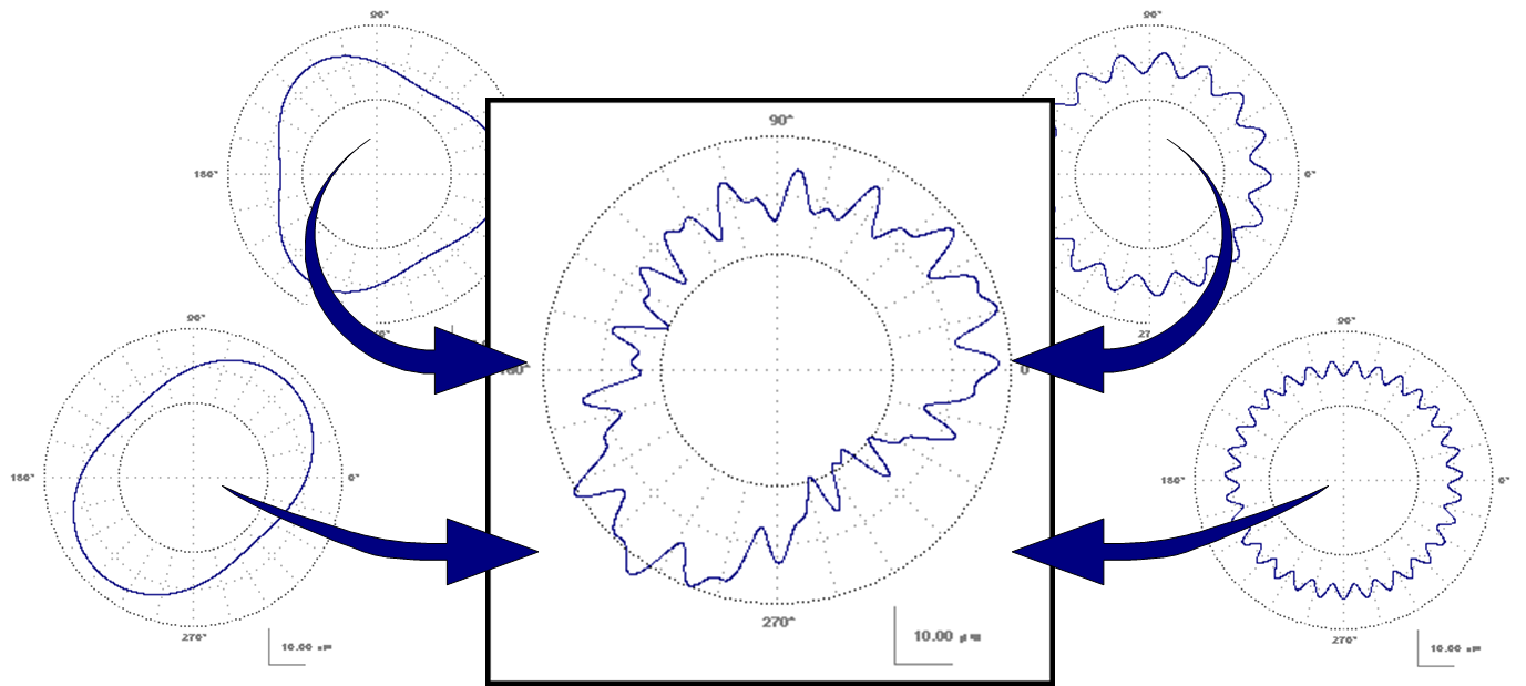
Each of the four shapes around the edges represent a “harmonic”. A harmonic is sine wave that occurs a certain number of times per revolution. This center shape is made up of four different harmonics. In this example, the harmonics are 2nd order (lower left), 3rd order (upper left), 17th order (upper right) and 31st order (lower right).
Harmonic analysis works in the opposite direction. Instead of combining simple shapes to make a complicated shape – harmonic analysis starts with the complicate shape and breaks it into simple sine waves. Typically, a graph or table is provided to tell you exactly how much of each harmonic is present in the data. In this example we see a bar graph. The taller bars indicate that there is “more” of that specific harmonic. For our current example with 4 harmonics, the bar graph would look like this:
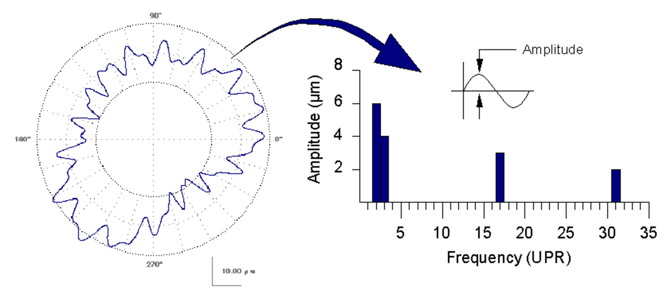
The 4 bars indicate that there is significant “amplitude” (or “height”) at these frequencies. On thing that this graph often leaves out is the “phase” of the harmonic. For example, the 2nd order (oval) component is currently oriented with the first peak at 45°. The phase of each harmonic tells us where the first peak occurs.
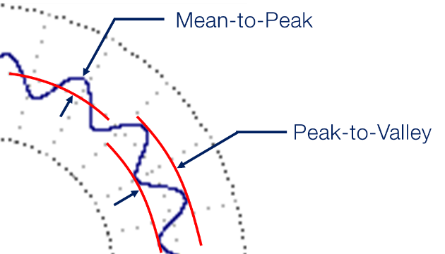
One thing that needs to be managed with harmonic analysis is what you mean by the word “amplitude”. Some people specify “mean-to-peak” amplitude while others use “peak-to-valley” amplitude. It is important to get this term right – especially if you are setting a tolerance on peak-to-valley and your supplier is measuring mean-to-peak!
What can we do with this?
One thing that we can do with harmonics is to put tolerances on them. This can be done with a table of harmonic limits. Or in other cases an equation that sets a limit “curve”. Below is an example from OmniRound with the harmonic limit curve being set by an equation.
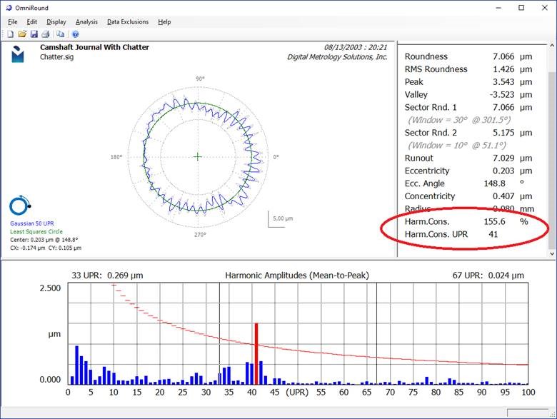
OmniRound highlights the bars that exceed the tolerance limit. Furthermore, OmniRound detects the worst harmonic (the one that uses the most of its tolerance) and reports the amount of tolerance it consumes. This is shown has the Harmonic Consumption (Harm.Cons.) parameter. In the above example, the chatter limit is exceeded at 41 UPR. This is shown on the graph and in the “Harm.Cons. UPR” parameter.
The Harm.Cons. parameter is a powerful way to combine harmonic analysis across hundreds of UPR and turn it into a single number. For a surface to be acceptable, all harmonics must lie below the tolerance curve. Thus, the Harm.Cons parameter must be below 100%.
Conclusion
Harmonic analysis is a powerful tool for understanding your roundness data. Check out Digital Metrology’s “OmniRound” software and get started with your own harmonic analysis for your data sets!