It seems like a rather trivial topic, but let’s think about our profile graphs…
The surface texture plot is often more important than the parameter value. Sure, the parameter value is the thing that is toleranced. But when a parameter like RzDIN goes out of tolerance, can you walk out to the manufacturing line and turn the “RzDIN knob”?
In order to control a process, it is likely that you will need to see the surface. Was RzDIN out of tolerance due to dirt on the surface? Was it due to porosity? Maybe noise in the measurement? These questions cannot be answered without a profile graph.
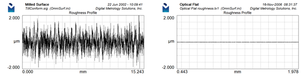
Many people (labs, manufacturing lines) provide profile graphs with their measurements. The good ones provide consistent, fixed scaling so that the graphs look the same from measurement to measurement. This helps highlight subtle changes. Auto-scaling should only be used as a starting point while you are figuring out what your fixed scales should be.
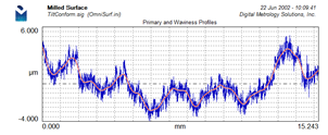
Take a look at these two profile plots from OmniSurf. Notice any difference?
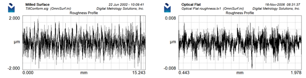
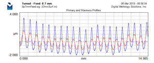
The above plot on the left is from a milled surface. It has an Ra value of 0.417 µm. The right profile is from an optical flat and it has an Ra value of 0.002 µm. That’s a huge difference!
This difference is more apparent with consistent, fixed scaling as these graphs show:
However, there’s more to this profile plotting topic:
Most people simply plot a roughness profile – after all, roughness is usually the thing that is toleranced on the drawing. However, OmniSurf’s default graph type is “Primary + Waviness”. This is for several good reasons.
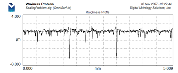
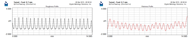
1. A roughness graph doesn’t show waviness.
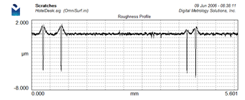
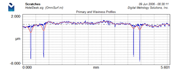
Here’s a roughness profile for a leaking shaft:
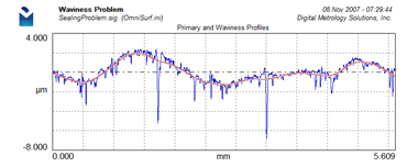
Here’s the same data with the primary and waviness profiles plotted. It’s very apparent that waviness is more significant than roughness.
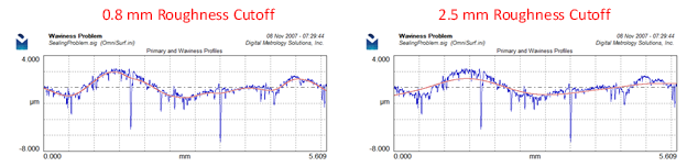
2. The Primary+Waviness graph shows how the filter is working.
With the P+W graph you are able to see if the filtering “fits” the shapes of the profile. The roughness filtering operation takes place on the primary profile. Thus, it makes the most sense to display the filtering operation as applied to the primary profile. In the below example: we can easily see that the 0.8 mm filter cutoff does a better job of following the shape of the surface and thus it will do a better job of describing the shapes that ultimately caused this component to fail.
3. It’s easy for your eye to “subtract”
The roughness profile is “everything that is above and below the waviness profile”. When seeing a graph like this. Your eye can easily see what is above and what is below the waviness profile. There really isn’t a need to even plot roughness!
4. It’s very difficult for your eye to “add”
It is hard to visual how this roughness profile and this waviness profile combine to form the “real” surface:
Putting the two graphs on top of each other doesn’t help very much:
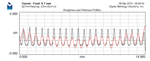
However, if we plot the Primary with Waviness profiles this is our view of the surface:
With this graph we can immediately see:
– The filtered waviness profile is moving up and down with the feedrate… might be time to consider using a longer filter cutoff
– The profile has a general “U-shape,” the middle is lower than the edges. This was very hard to pick out of the other graphs.
– The Primary+Waviness graph gives a much clearer picture of the actual peak-to-valley heights of the profile features. These actual peak-t0-valley heights are much higher than those indicated on the roughness profile graph.
5. Don’t fall for filtering problems
When plotting the roughness profile for a surface with deep scratches or pores we often see high peaks on each side of the scratch or pore.
Sometimes these are real. Sometimes they are caused by the filter being “pulled” into the valleys. The Primary+Waviness plot helps us know for sure:
In this case, the filter is being pulled into the valleys. The areas above the waviness profile become the artificial “peaks” in the roughness profile. This is definitely a case where robust filtering is needed.
Hopefully, this help you make more sense of your profile graphs and ultimately make better decisions based on your measurements!
For more information contact Digital Metrology today!