A picture is a powerful tool for understanding surface texture. A properly scaled profile graph or a beautifully rendered 3D surface can give great insight into surface features that may not be easily described using only numbers or parameters.
An improperly scaled image, however, can get you running in circles. If you are trying to compare process data, say, from two consecutive days, an incorrectly scaled image may suggest a major change with your process equipment that is not really happening. Or, it could lead you to think that all is well when an issue is really lurking, masked by the incorrect scaling of the data.
The key, of course, is to be sure that you are comparing “apples to apples,” which in this case means consistent lateral and vertical scales. And what better way to illustrate this issue than by comparing apples…and oranges.
An (informal) scientific study
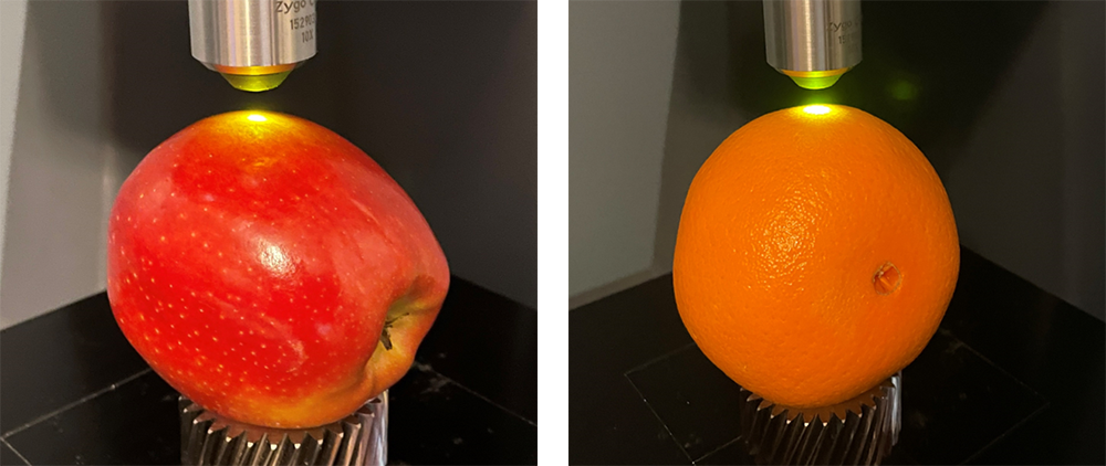
The surface texture of an apple should be easy to differentiate from an orange, right? After all, one is very smooth, the other is porous to a degree that’s obvious to the eye (it’s no wonder the term “orange peel” is used to describe a porous or wavy paint job). Here are the technical details for our experiment:
- Apple: Gala
- Orange: Kroger, medium, navel
- Measurement Instrument: Zygo ZeGage Plus optical profiler with 10x objective
- Software: OmniSurf3D
- Short filter: 0.008 mm Robust
- Long filter: 0.8 mm 2nd order Gaussian.
Here is a surface from each. Can you guess which is which?
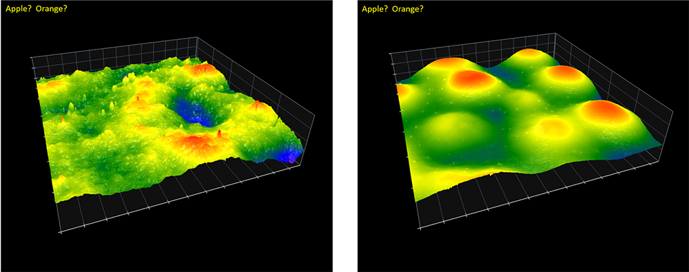
Without showing the lateral scaling this is just about impossible. We need some reference to tell us the relative size of the features on the surfaces. So, let’s add the scaling in the horizontal plane:
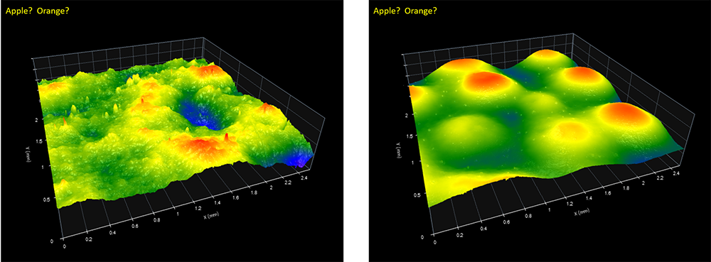
Does that help? Maybe a little. We can see from the scales that both of these images are the same size, laterally: 2.5 x 2.5 mm, stitched. We have our first clue, then: the blue “valley” in the left image is about the same size, laterally, as the “mounds” in the right image. But in this case, the lateral scale information does not help us differentiate between the images.
The biggest understanding of texture comes from the heights. So, let’s add the vertical scales:
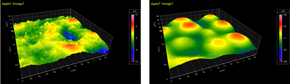
Now we see that the left image has a vertical scale range of ± 10 µm, while the right image has a vertical scale of ± 100 µm! The auto-scaling feature has set these scales in order to display the heights using the maximum range of colors. While this is often just what you’d want the software to do, in this case it has the unintended effect of making two very different surfaces appear to be equally bumpy.
Now, turning off the auto-scaling feature, we make both vertical scales the same, at ± 100 µm:
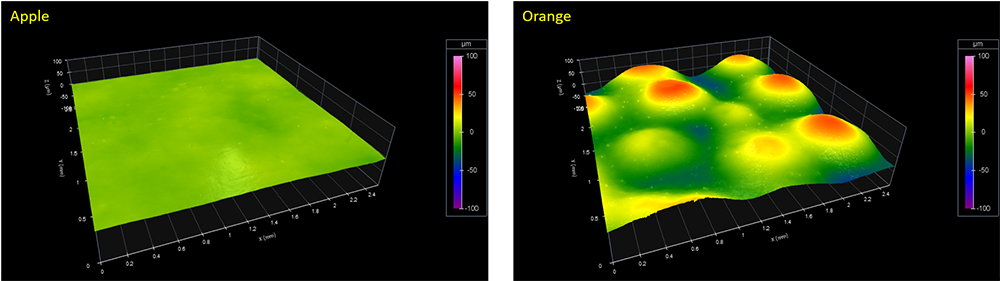
At last we can see clearly that the left image is the apple skin, while the right in our orange peel.
You need to keep this in mind when you look at your surface measurements. Auto-scaling can fool you—so can your choice of palettes, user limits, filters, etc. If you are going to try to compare data, be sure that you aren’t comparing apples and oranges!
For more help with visualizing and understanding your surfaces, visit the OmniSurf3D software page.